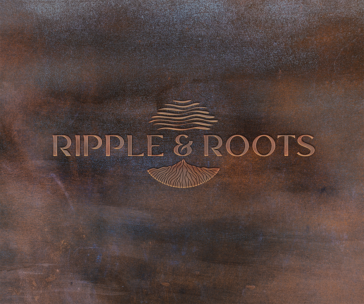
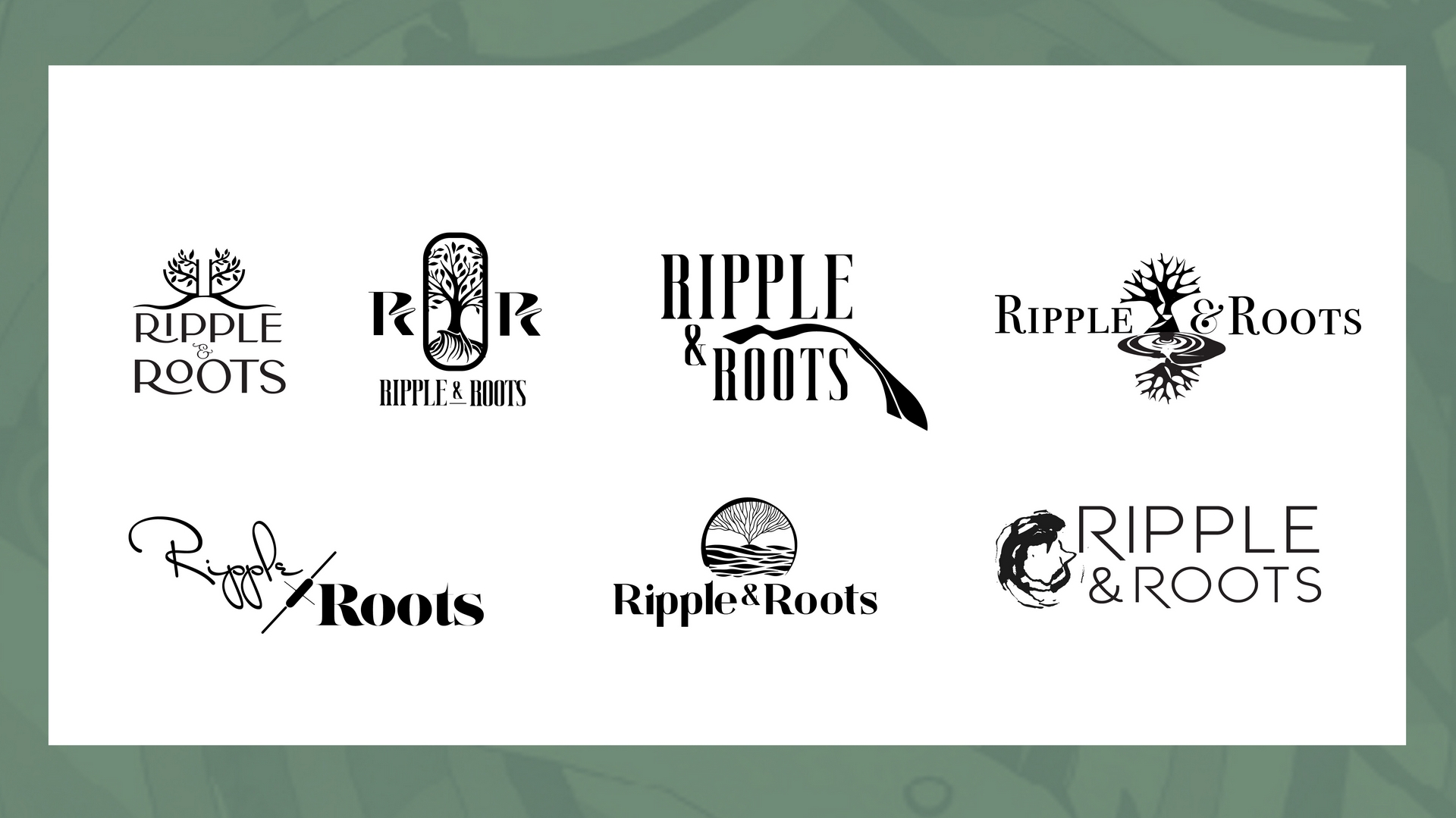
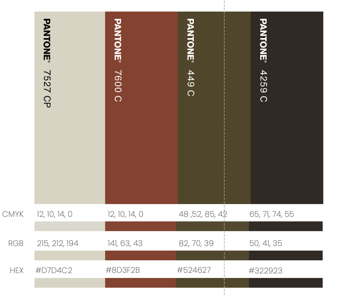
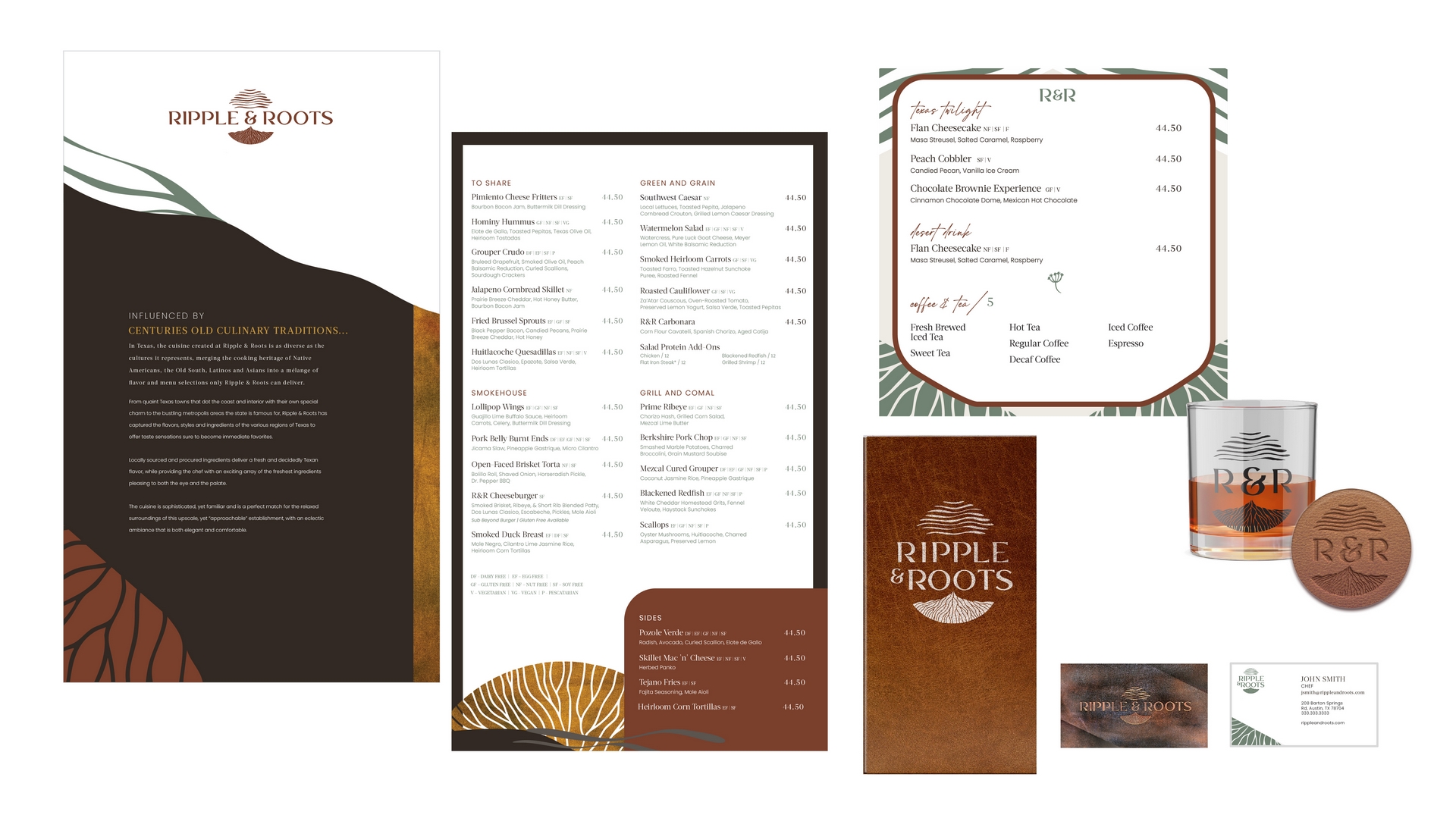
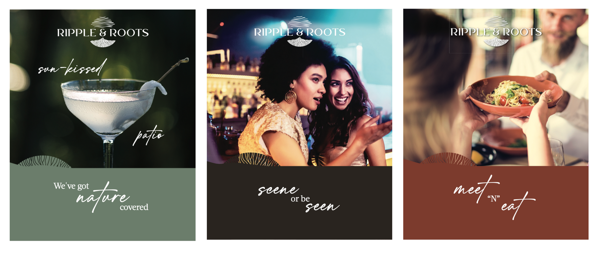
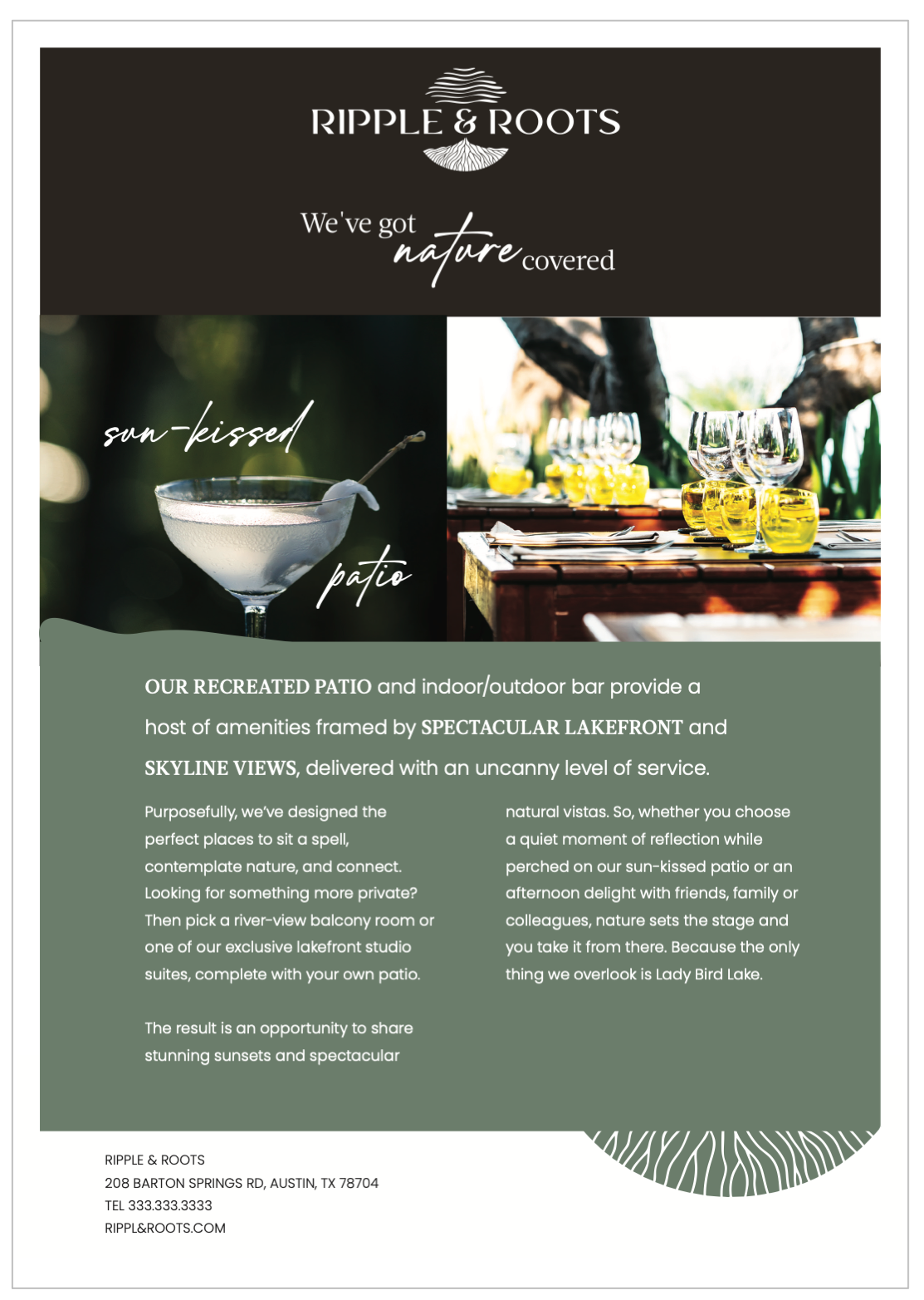
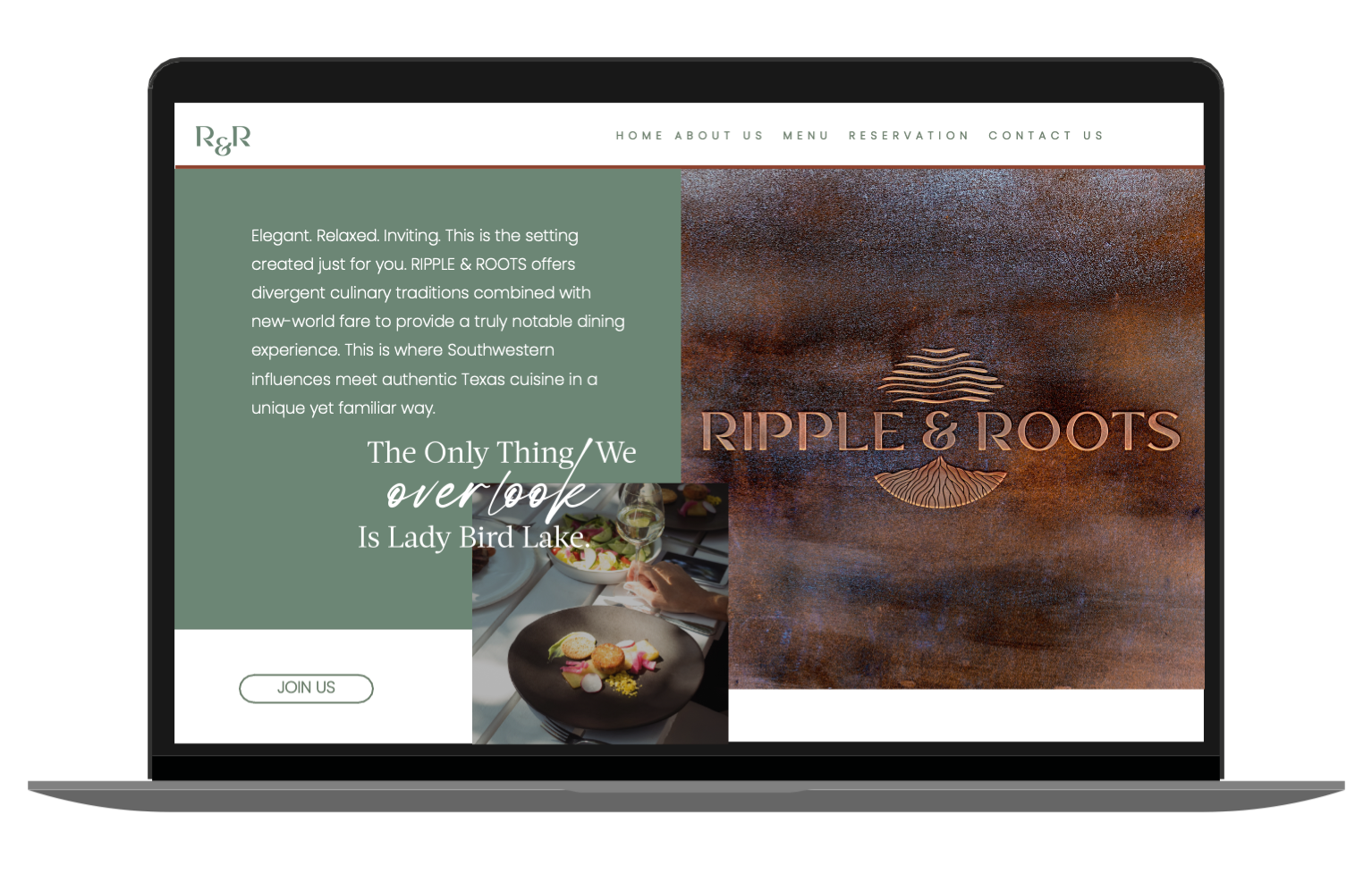
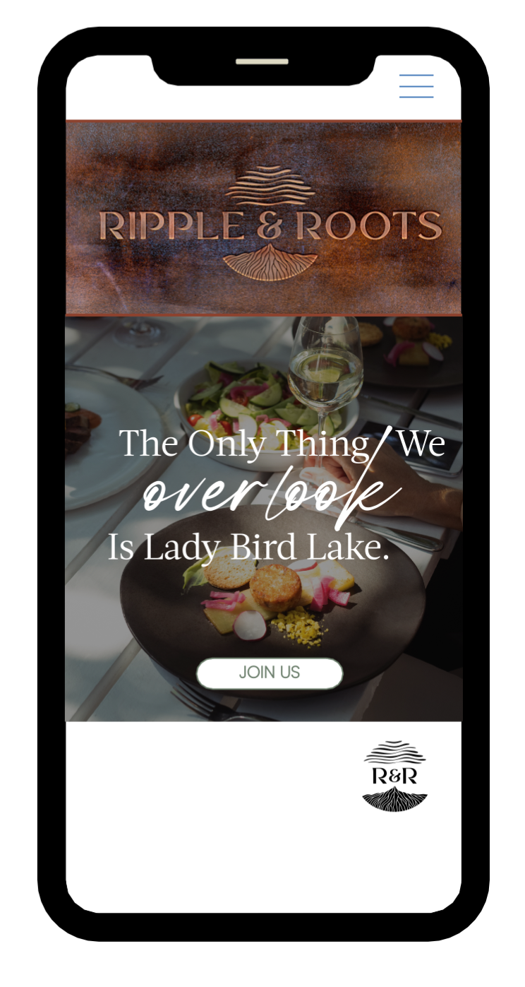
Ripple and Roots emerged as the winning concept, a name that captures water and earth, nature and nourishment, the transient and the permanent. The brand identity builds on this duality through organic forms, earthy tones, and refined typography that feels both grounded and elevated.
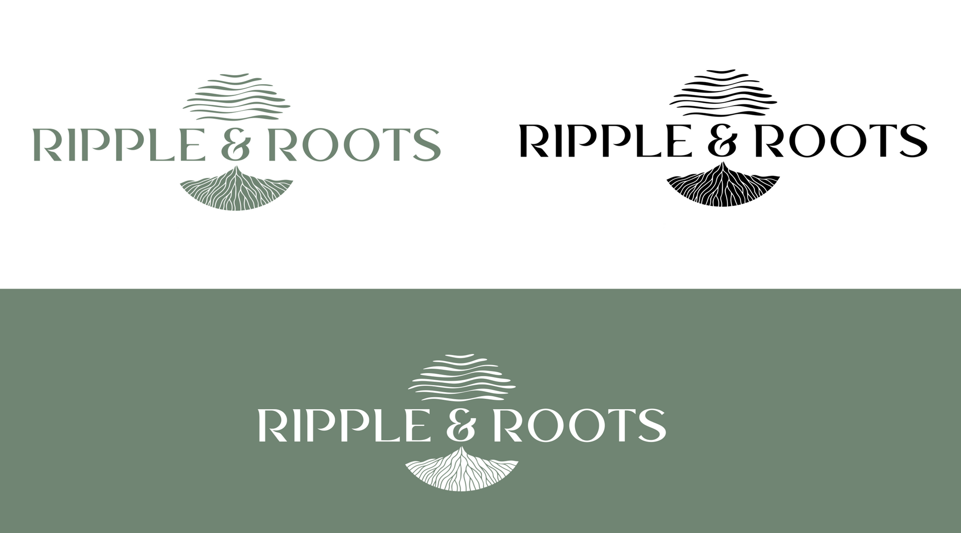
Logo Design: The mark intertwines water ripples with root-like forms, creating a visual metaphor for the restaurant's positioning. Organic, flowing lines reference the lake and natural landscape while maintaining the sophistication expected of a Hyatt property.
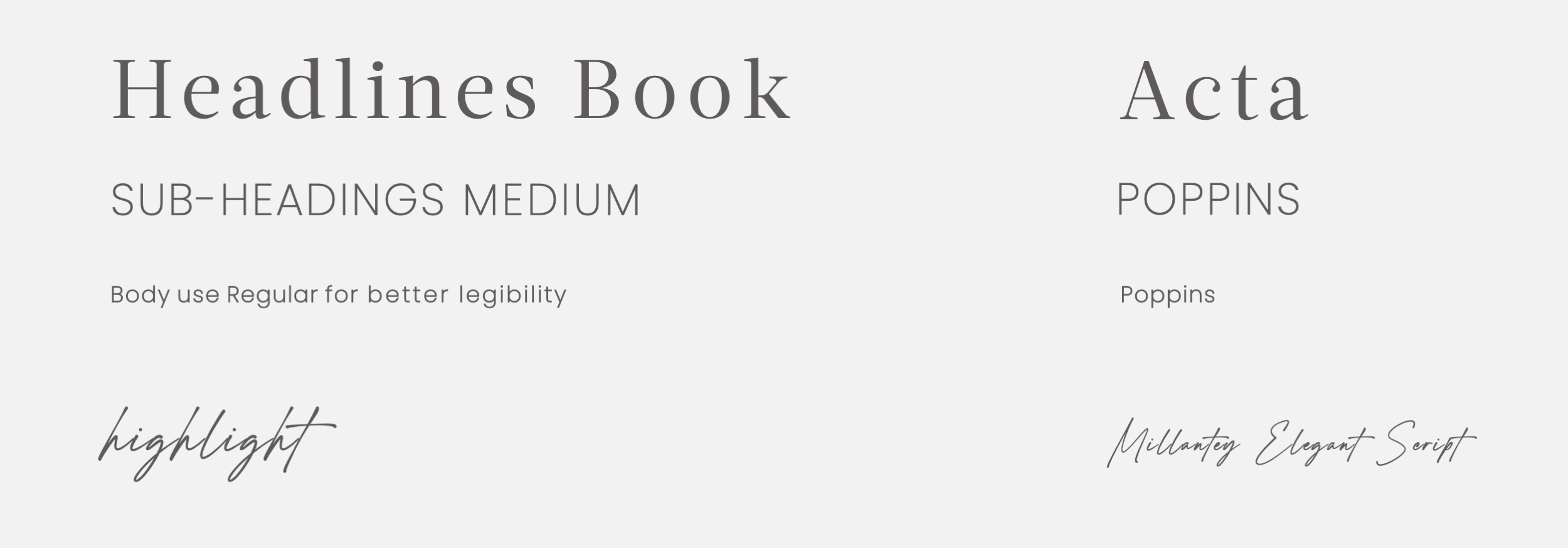
The lockup pairs this symbol with clean, modern typography that grounds the brand in contemporary Austin dining culture.
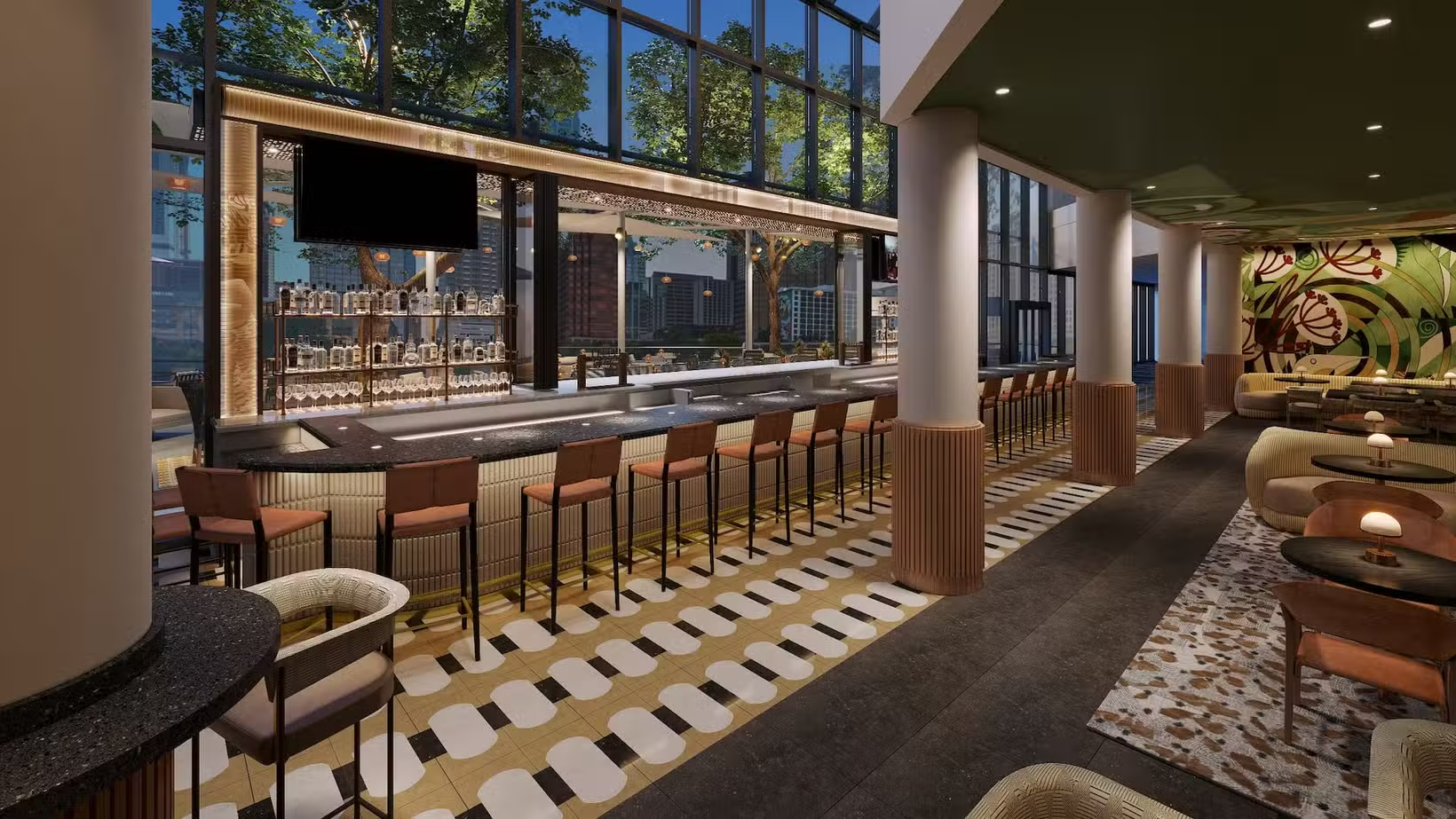
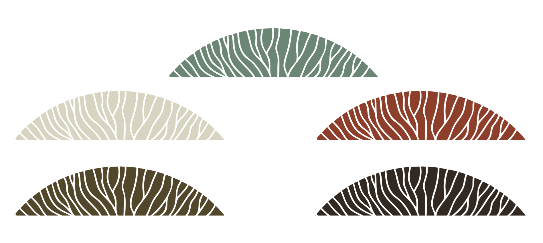
A visual system built on the interplay of fluid and organic elements; ripple patterns meet botanical textures, creating a cohesive language. The graphics translate the logo's core concept into flexible design elements that can scale from intimate menu details to large-format environmental applications.